#0416
Brand identity
Studio
Oskel identity system
A mark, a palette and a type system for a developer-tools startup that wanted to look calm and exact.
Turnaround
38h 02m
Revisions
2
Designer
Rui Kaneda, Lisbon

The brief
We're renaming to Oskel. We need a logo, colours and type that work in a terminal, on a conference badge and on a website.
What we delivered
A two-square mark, a four-colour palette led by volt green, a type pairing and a 16-page guide.

How it went
Oskel builds tools for engineers who distrust branding. Rui started from the product itself: two panes, one offset. That became the mark.
The palette is four colours, one of them loud. It works in a dark terminal and on a white badge without changing anything.
The guide covers the mark, colour, type and eight real examples, so the next requests (a website and a launch set) could start straight away.
16
Page brand guide
2
Revision rounds
Next in the rack
Open the next delivery →
More from the rack
Every other delivery this month.
All work
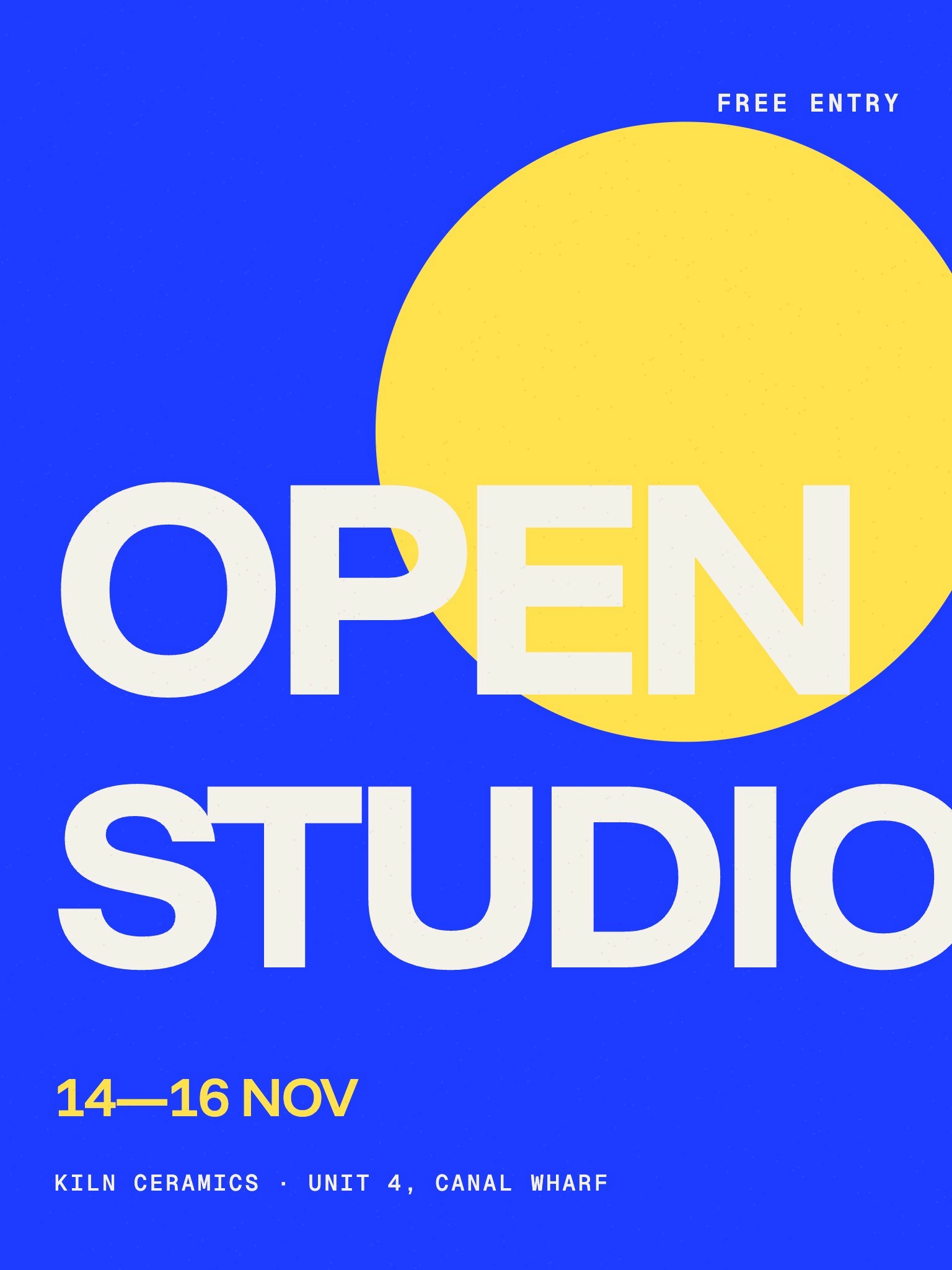
#0422
16h 20m
Kiln Open Studio
Event poster

#0421
41h 05m
Fieldhouse Coffee
Packaging system

#0420
12h 48m
Squeeze & Co.
Social campaign

#0419
22h 40m
Maren Skin
Launch poster

#0418
39h 47m
Paloma Ceramics
E-commerce refresh

#0417
44h 31m
Trailhead
iOS app screens
#0416
38h 02m
Oskel
Brand identity

#0415
47h 10m
Gridwork
Icon set · 120 icons